Nice Asset! now i can finish my project to get my title :). I want to became patreon, but it seems i can't connect to get the other characters. Do you know how can i fix that?
I noticed someone has reposted these assets here on itch. I reported it, but I thought it might have more weight coming from you: https://novacrafter.itch.io/street-fi
hell yes! your assets are all awesome, but this one makes me wanna do a backflip. only i can barely get out of my chair anymore, so i will just do a mental backflip.
← Return to asset pack
Comments
Log in with itch.io to leave a comment.
Nice Asset! now i can finish my project to get my title :). I want to became patreon, but it seems i can't connect to get the other characters. Do you know how can i fix that?
Thanks for your work!
love it
I noticed someone has reposted these assets here on itch. I reported it, but I thought it might have more weight coming from you: https://novacrafter.itch.io/street-fi
Thanks for letting me know.
Hello! Super cool pack. I just noticed the Enemies Add-on doesn't contain the ase files -- is that intentional?
Thanks for the headsup I lost some of the ase files along time ago, will look for those and put them in the next update.
I didn't see it mentioned yet, so I thought I'd point out that a solid solo card game was made using your art. The art really helps set the theme.
City of Fury, 9 card game by Barny Skinner
Hey man, I love your style. So far this is what I've been able to make with this asset.
I'm still thinking of expanding the game but I'll need more sprites of enemies and for the the heroes.Amazing! Great work!
became a patreon and still cant access your stuff
He's trained in the ancient art of punching people in the face :)
I love your style, thank you!
Cool!
Hey man, I've been making a mini-game to use in my portfolio and I've used your art assets.
Here's where I'm up to with it:
I've been focusing on the sound effects/camera/other stuff for this mini-game - eventually I'll include the fighting :D
Great start!
Now with some actual fighting!
Cool! I love to see the assets in action. Keep the good work!
It's slower progress now, but coming along, refining things. I still haven't setup the boss yet :D. No jump kick, cans, or specials either ><
the figures on the floor are a funny touch. Keep the good work!
Awesome!
Streets of Rage - Fighting in the Street song started playing in my head. amazing work, as usual!
Aw, that's lovely!
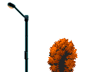
There's just one thing that somehow feels out of place to my eye: that foreground green bush.
I'm no artist but maybe the style is different? I was probably expecting something with more contrast, more black, and more rim-lighting?
Maybe I'm just picky, or got obsessed with that detail :D
...or maybe it's because of the palette and colour count. But again, maybe I'm just obsessing over that detail :D
Loving the pack! It really gets the right vibe!
(still, that bush really bothers me, apologies :D :D )
Thanks for the feedback. Fortunately, the bush can be removed easily.
I do see how the green bush pulls the eyes in. Can easily be fixed using the same colors. like I've done here.
Great job! Just an observation: for the girl, the "Hurt" animation is the "Jumpkick" animation
Thanks for the heads up, just fixed it.
Wow, Thank you very much! I want to use this asset for my project soon.
hell yes! your assets are all awesome, but this one makes me wanna do a backflip. only i can barely get out of my chair anymore, so i will just do a mental backflip.
Thanks
:D